Japanese Indigo Ink
Working through the amazing ‘Colour is Alive’ text by Greta Facchinato, I was drawn to the process for Japanese Indigo Ink. The book has recipes and instructions for colors that can be applied to Paper and Fabric, and this ink is listed as suitable for both applications. To respect Greta’s work, I won’t post the recipe here but it is on page 56 of her book and I highly recommend purchasing a copy before they are sold out.
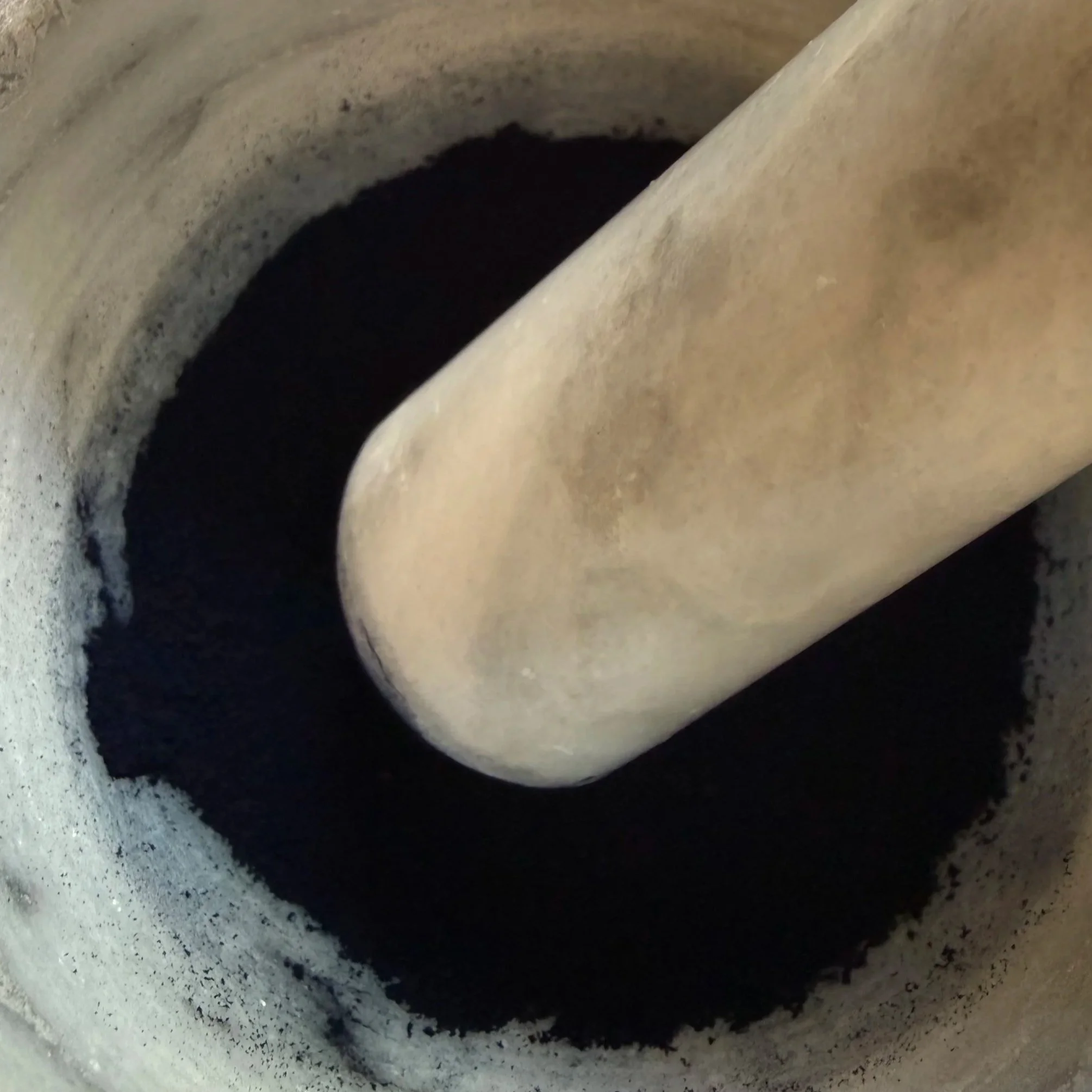
This process was very different from the previous Avocado Ink that I made (page 76). The Avocado Ink was made using the pits of the avocado to create a decoction that is modified and thickened. Working with Indigo pigment is a different process that involves using a motor and postal, a muller and glass plate, and a little more elbow grease.
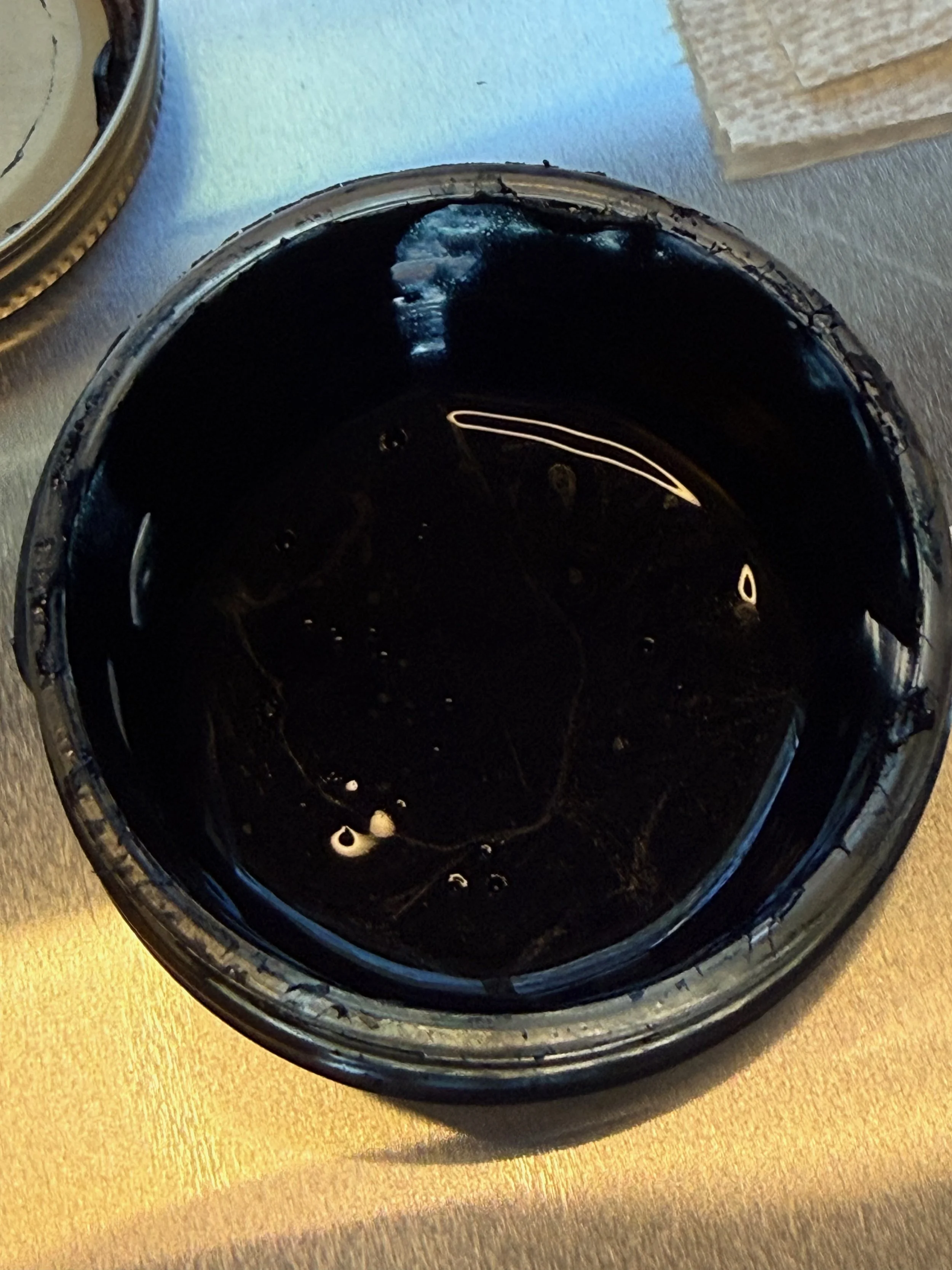
I worked through the recipe and had a few hurtles. I added my thickeners at the same time and in its whole amount. Should have know better. It wasn’t clear in the book to gradually add the material, but when reviewing the video lesson from Greta it became clear that I should have paced it. This may have added a bit of extra time working the ink. It was thick and not smooth for quite some time, but after a bit of stubborn determination I ended up with an ink that looked similar to the quality of the avocado ink. I ended up with about 50ml of water that was not incorporated. I spent some time thinking about whether or not I should add it, and decided to let the ink sit overnight before deciding.
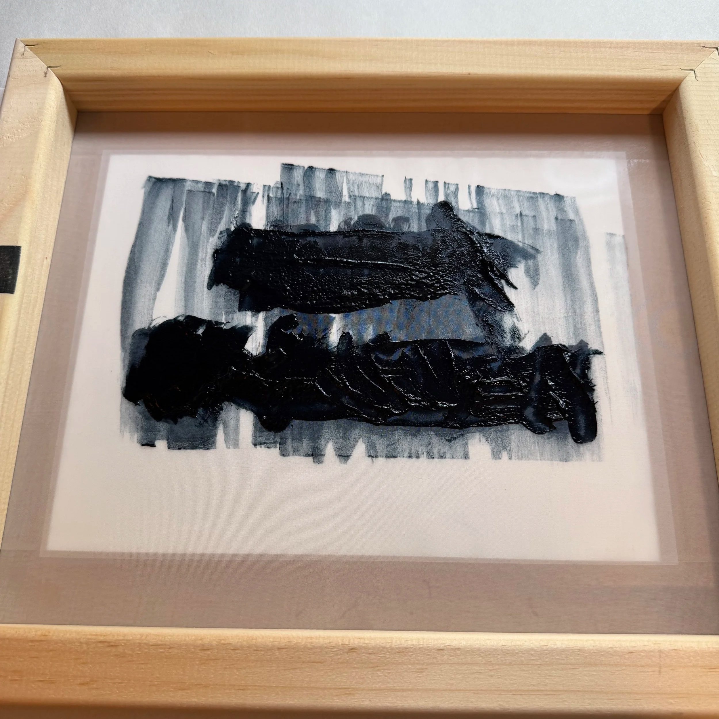
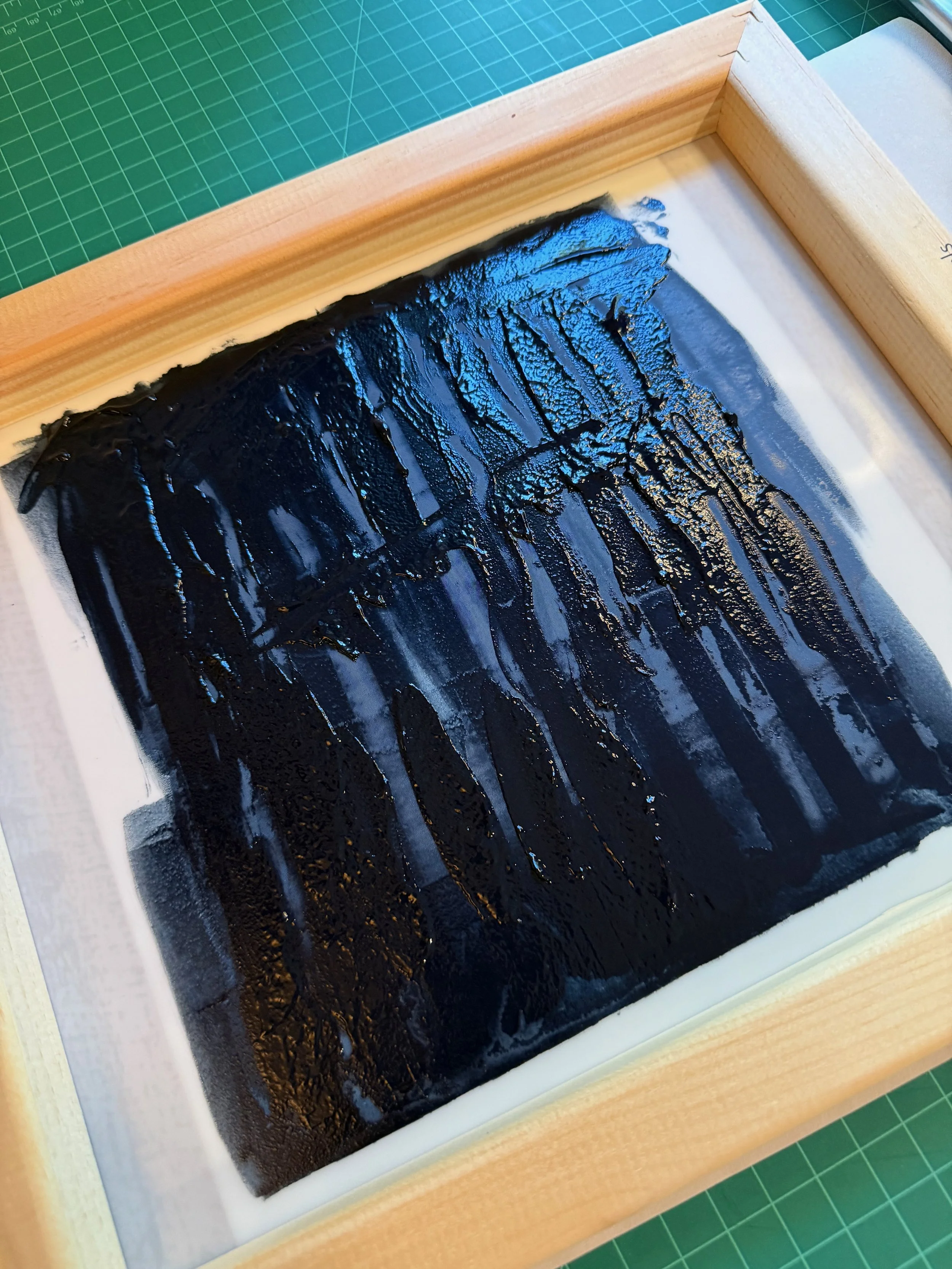
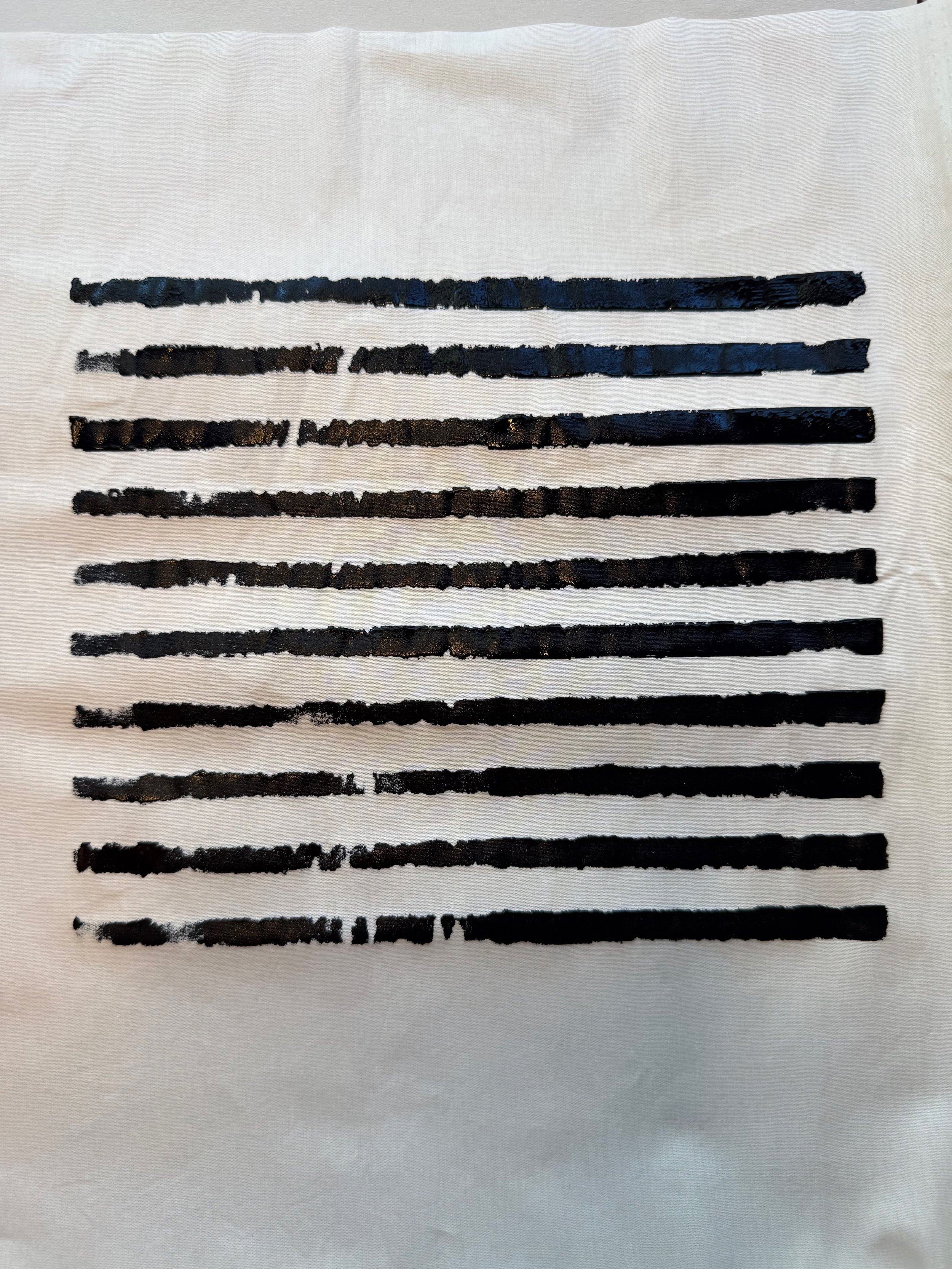
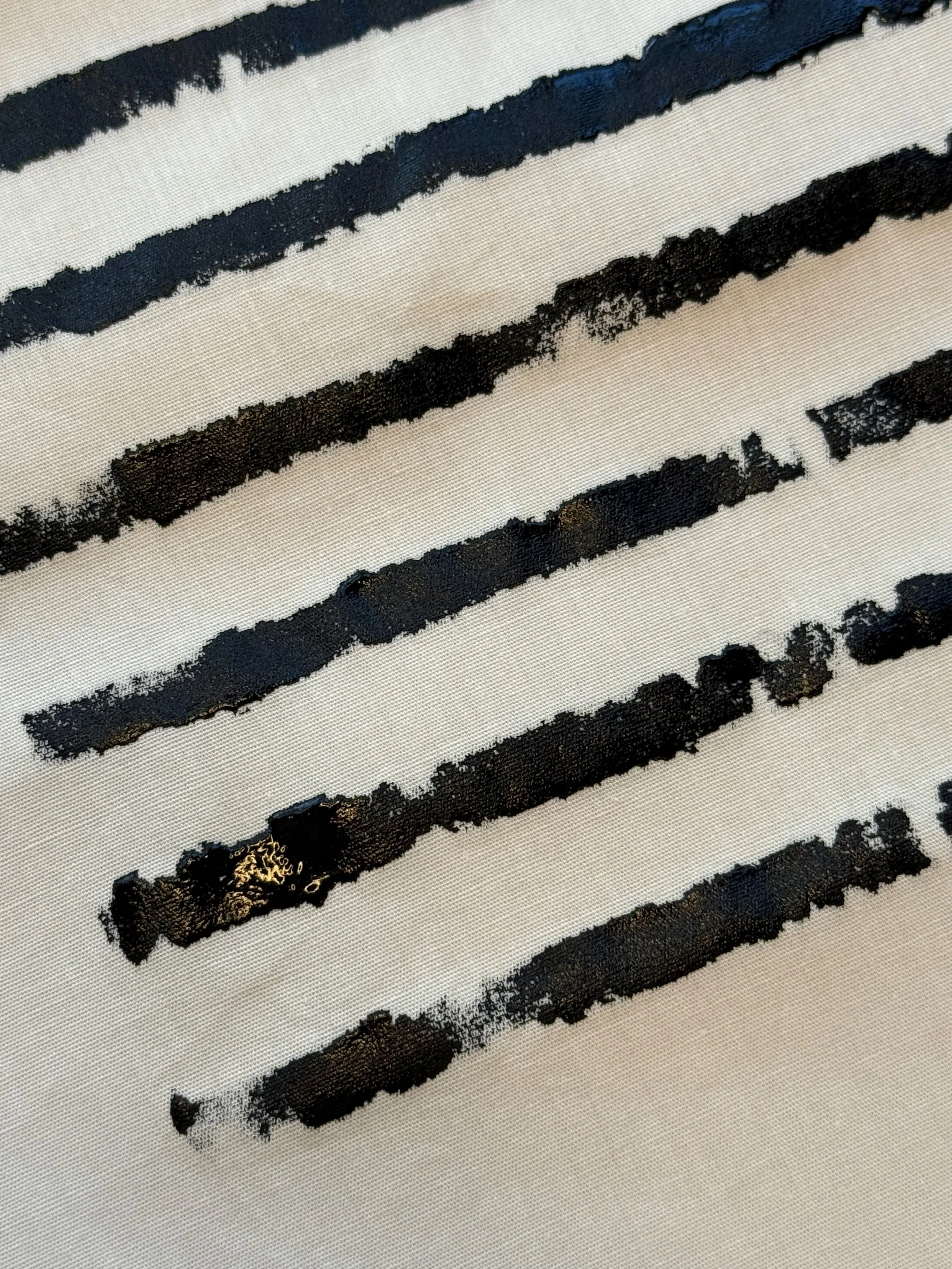
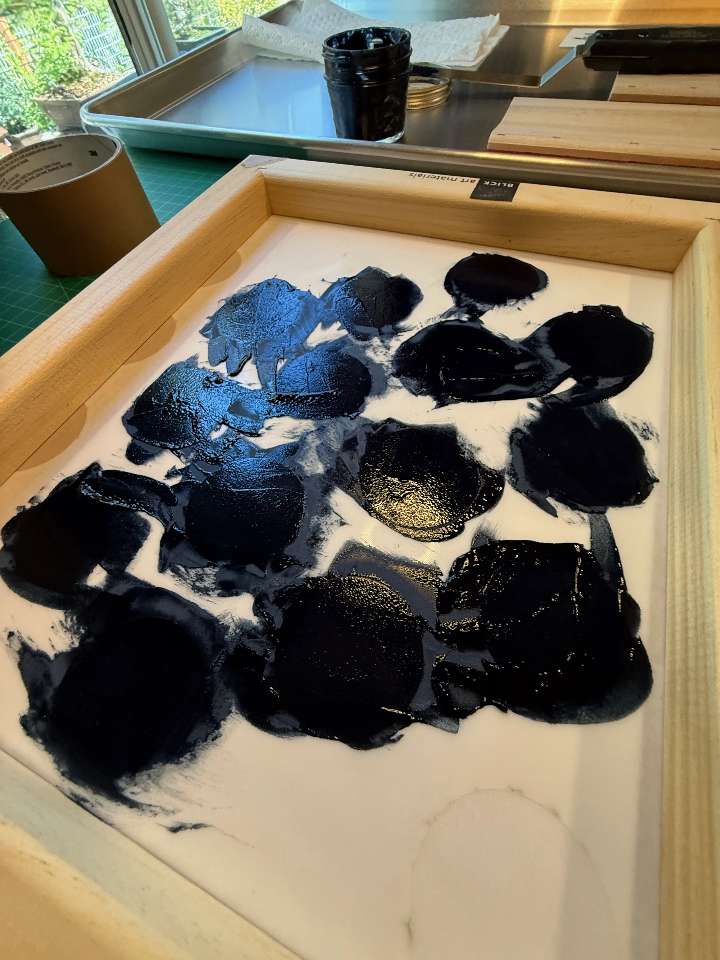
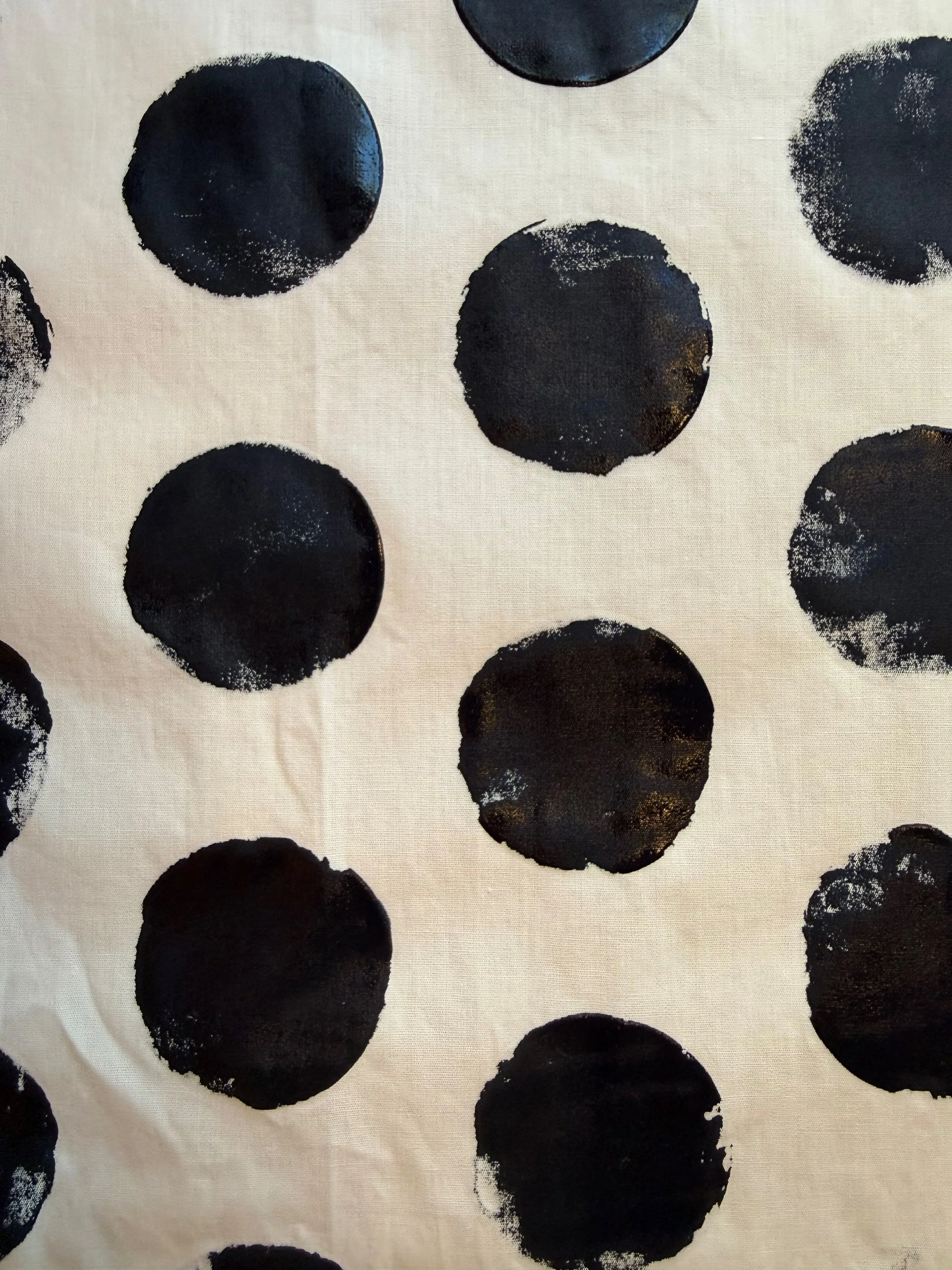
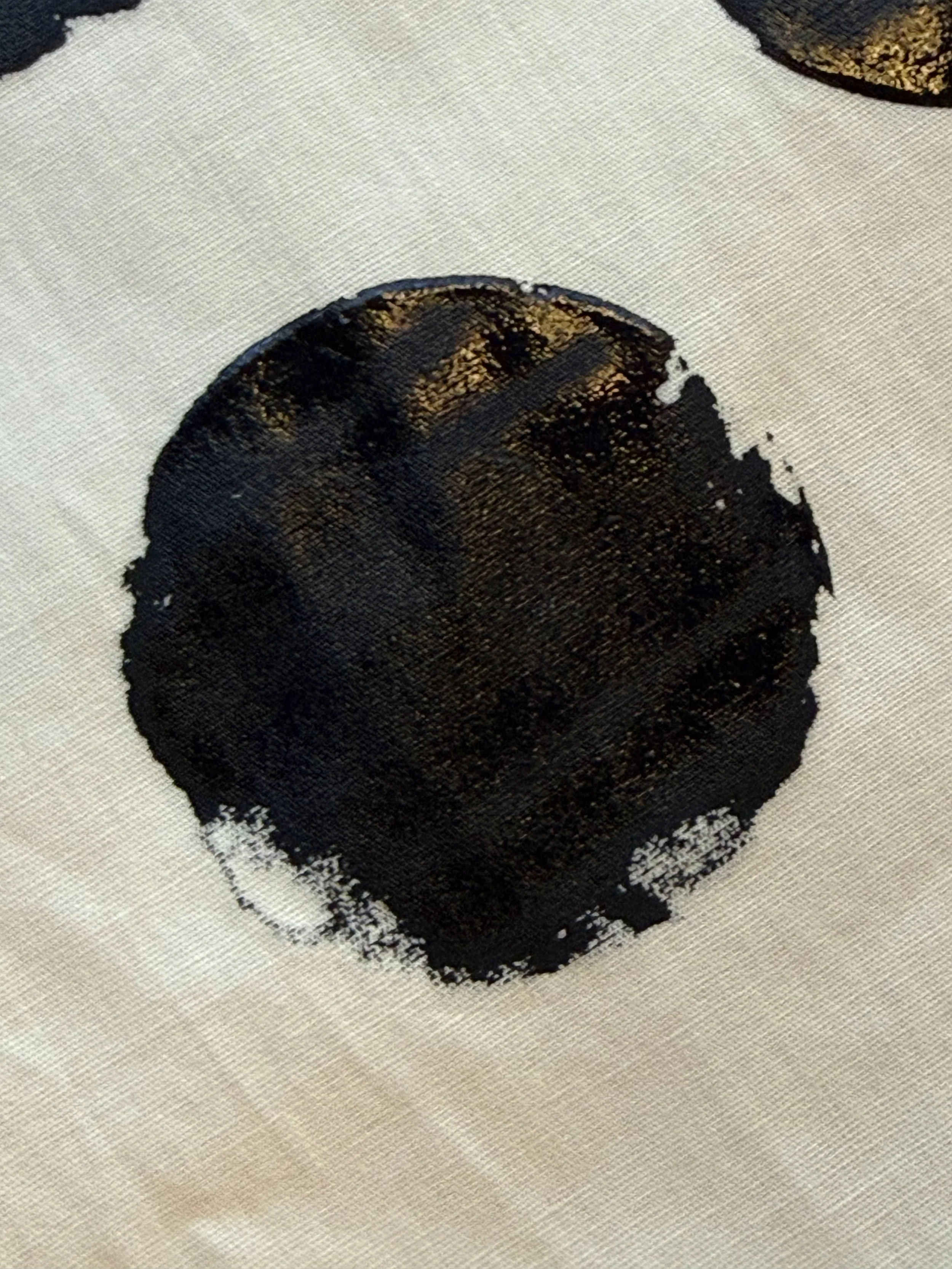
The following day, the ink looked workable to I pulled a few prints onto a scoured pima cotton (no tannins or mordants). Looking at the transfer, I ended up with really strong bold color, but perhaps the ink is a little thick. It still pulled, and dried beautifully, but there were some areas of a spotting and the screen after looked a bit caked.
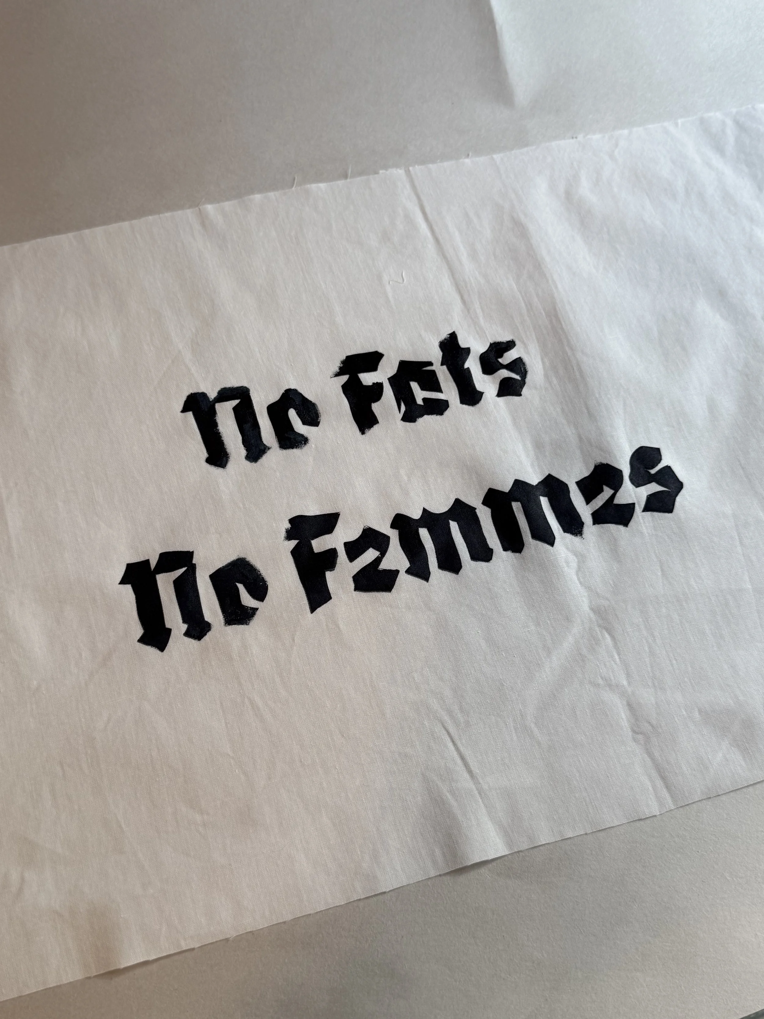
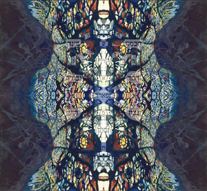
The prints the following day looked in tact, no flaking. There was some puckering as the pieces dried, but they should work out in the wash. The image showing the print with the text is this print. (Please note the the series this piece is from is a commentary on homophobia within the gay community, it's out of context here so wanted to wave my rainbow flag at the same time I shared it).
2 days after making the ink, I pulled batch of small circle and line prints to use as test samples. I used a different thickness stencil and ended up with pretty disappointing coverage and edges. I have been wondering if the thicker stencils have been creating a bit of a ledge around the edges, and after I finish this batch of supplies I am going to work with thinner material.